
Good day readers. This is the latest in my Devil is in the detail series focused on aspects of MND disease treatment research. Specifically, it is a second commentary on trial statistics and a follow up to 50% chance of rain today
In today’s hyper, 24 hour, information overload social media world, ‘statistics’ are quoted freely and liberally. Behind these often simple numbers is, however, substantial detail and sound bites can, and do, mislead. From those over zealous news article headlines to the innocent repetition of out of context figures, we all have to look no further for abundant examples of this than the current COVID pandemic.
At the same time it can be quite a challenging task to untangle the wheat from any potential chaff. Although trial data is not the sole arbiter in deciding drugs efficacy, it is the bedrock foundation, that if not solid could bring all the walls tumbling down. Afterall, the aim of human disease research is to provide access to not just any treatments, but truly effective ones.
Currently, we are in living a time of strong and quite rightful optimism with many active trials for MND, new treatment targets identified and the proliferation of innovative trial techniques. Real breakthroughs are now tantalisingly close. Statistics will inevitably appear more and more, and making sense of them will be critical in understanding an experimental treatment’s real potential for approval and eventual access to patients.
I hope you will find this an interesting discussion, thought provoking and that it, perhaps, might encourage you to dig deeper in a world where we are so easily and often pushed the other way. No-one should ever be afraid to ask an expert, whether it be a friend, an academic in the field or a professional from an organisation (eg the MND Association) if they are unsure about ‘statistics’ presented in the public space.
But first a bit of statistics history/folklore.
Nearly 70 years ago, way back in 1954, journalist Darrell Huff penned the now quite legendary little book, How to Lie with statistics. I first read this tiny paperback as a teenager during my formative education in mathematics. It went on to be the biggest selling primer on statistics in publishing history. A lot has certainly changed in those 67 years but, frankly, quite a bit hasn’t!
It’s title is quite provocative isn’t it? It undoubtedly changed the probable sales figures of a book that is basically no more than – ‘Statistics – an Introduction’. Darrell was not a scientist of any form and nor was he a trained statistician. Infact, his lack of understanding of core statistical principles got him into hot water in a never to be published sequel! But the original remains a classic writing of communication skills and contains some timeless and valid observations that we all should be aware of.
Returning to our disease challenge. I will now delve a bit further into those important little numbers that can range from quite simple maths, through to some advanced analysis techniques and even some really serious rocket science calculations. You might wish to take a look at the mathematical workings behind the work that revealed that MND is actually a multi step disease, as an exemplar of the complexity that can be entailed.
For this post, however, I will keep to something much simpler but equally, if not more, important to we MND/ALS patients. This disease, that I and 5000 others in the UK live with, sets many technical data challenges to our scientists and regulators alike, during the continuing search for those all elusive treatments. Like any prospective therapy, there is a need to identify solid signs of efficacy and who for. At such an explosive time of promise we might be faced with a tsunami of data.
So, today, I will discuss some of the current ways that valuable insights are being obtained from trials, why we need to take a step back when presented and consider what they really might mean. And I will round off this post with an example of a classic statistics warning, highlighted in How to Lie with Statistics, the ‘gee whizz’ chart.
Identifying ‘Responders’ to experimental treatments.
Late stage clinical trials have as their prime raison d’être, the proof, using objective data, of a positive effect on slowing, stopping or reversing a disease’s course in an individual(s).
For example, imagine a brain cancer. Reducing to the most simplistic measurement, a drug that shrinks a tumour, lastingly, by say 30% in an individual or many patients, without serious side effects that would outweigh the shrinkage could be considered highly effective over a prescribed timeframe compared to no-treatment or placebo.
With a growing and spreading physical tumour this objective observation is a well accepted measure of effectiveness, as it largely visibly correlates with the destruction caused by the disease. Statistically, measuring such a drug effect can be relatively easily achieved.
But with MND/ALS, we still have no, as yet, solid, repeated and proven objective measurements of the disease which involve biological measures – although one is now very close indeed.
The gold standard remains, for now at least, a patient questionnaire known as the ALSFRS-R rating. This is a scale ranging from 0 to 48 points, where 48 points indicates no loss of function (disease free?), and 0 points is effectively loss of all human voluntary neuromuscular function! This is what I would describe as a ‘1-degree’ removed abstract measure of disease progression. Ie it is a number that is believed to represent a good indication of disease progression, which doesn’t actually measure disease pathology changes, but more it’s ‘clinical observation’.
Despite many quite serious limitations, this number still remains a valid and potent assessment of disease progression, especially when ‘consistently’ measured, over a suitable period of ‘contiguous’ disease time, with ‘good’ sample sizes and participant stratification/categorisation.
MND trials typically seek out a significant reduction in the ‘rate’ of loss of this value over the period of the trial. With the fluctuating, and ‘jagged’ nature of ALSFRS-R progression, short disease trials are extremely problematic without solid biomarkers. 18 month trials are still widely the accepted consensus as the minimum time frame for currently confirming marginal drugs effects. And yet, there are, not unsurprisingly, calls for shorter and shorter trials. However, shortening, inappropriately, trials might increase the time to deliver truly effective treatments and worse still, miss potentially effective drugs that might only get shelved again.
And then we have the question of what actually is clinically a value that is considered significant? And over what time period? Most of us patients would agree that even a 1 point ‘improvement’, if proven and attributable, is worth while, but of course we are hoping for far more effective trials.
It is worth being just a little bit cautious with the word improvement in this context. It is a positive change in the ALSFRS-R rating slope from pre-treatment to end of trial. This can be misinterpreted. Consider the following statement:
The treatment showed a 1.2 point improvement in ALSFRS-R slope over x months.
The ‘human mind’ will almost always hear this line as a real improvement, ie getting better or disease reversing.
However, It may not necessarily be so as it is a change in the slope, and a patient(s) could be still deteriorating significantly. If a patient appears to be deteriorating at 2.0 points per month, for example, a 1.2 point improvement is still a 0.8 point loss per month, which over a short period of months could be well within disease natural history variation.

It goes without saying, however, that a positive change could indicate a significant slowdown, which is very desirable, especially if sustained.
A fairly recent trend (last 5 years or so) in MND trials has been the definition of a ‘responder’ based on the ALSFRS-R rating, trying to emulate the cancer responder in an attempt to unearth some ‘hints’ of potential group efficacy. These are important and valuable approaches that can be used in the search for hidden ‘clues’ that in turn could be used for further targeted research and trial design.
For example…
Rather than just look at averages of improvement/deterioration, some trials report grouping, for example.
5% of patients lost > 10 points over the trial length
10% of patients lost < 5 points over the trial length
etc.
Another common technique, is to draw an arbitrary line, eg a beneficial change in ALSFRS-R rating slope of say +1.4 points per month over the trial length, above which a participant will be classified as a responder. Under this value the patient would be defined as a non-responder. This could unearth some potential signals of an effect, which although not fully understood at the time, might just form the basis of new trials and hypotheses.
I often hear, and read, that such early preliminary findings should justify the wide spread early approval of an experimental drug. If only life were so simple. Whilst I might agree, that there may not be much of a debate if the drug/treatment has a major and pervasive effect, as the differences could be huge and responders clear cut. However, when looking for small treatment effects, which researchers are often doing when an exploratory treatment is not clear cut, it can be very problematic. Distinguishing the significantly variable natural history of our variable disease from a true treatment effect is key. We are all inclined as humans, if not evolutionary engrained, with seeing what we would like to see, rather than perhaps the full picture.
I will now work through a completely fictitious example* to show some of the complexities our researchers face.
* please note that this example uses simple statistical techniques to demonstrate the challenges of analysis and does not necessarily use the same statistical tests used in real studies. The sample also assumes no patient prediction assumptions and a simplistic uniform consistent monthly progression rate for patients.
The following sets of data are from 2 hypothetical trials and, A and B, that I have created. In both there are 20 patients in each of the placebo and treatment arms (40 in total). Each hard bordered cell in the tables below represents one patient, treatment or placebo.
I have highlighted, in green, those who showed an ‘improvement’ response of 1.4 points ALSFRS-R points or higher per month (slope change) and their values. For the purposes of this discussion, please assume this is over a period of a 6 month trial time.
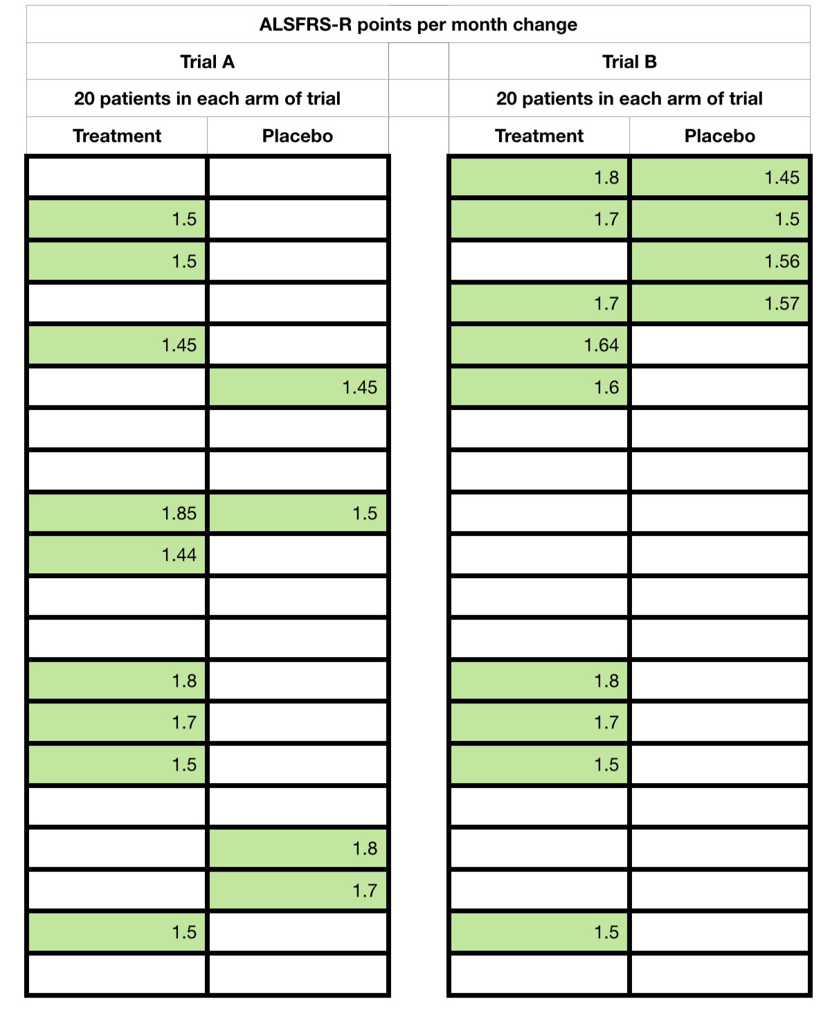
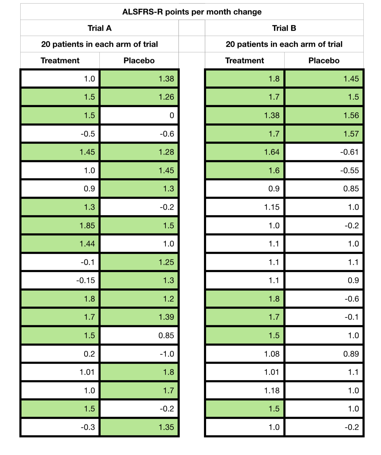
You will note that the treatment arm contained more responders (1.4 positive change or higher) than non responders in both trials. But, take a look at the spreads of values as I now start to reveal all the data points, ie showing each patient and their monthly change.

If you were just told the numbers without all the ‘point’ data, what might you think? Has this changed on seeing all of the data?
And I will let the reader react to what happens if I now change the arbitrary responder boundary to 1.2 points. Trial A suddenly reverses to advantage the placebo arm!
Trial B remains the same, with a treatment advantage ‘hint’.
I now reveal, finally, the averages, differences, standard deviations and p-values (significance values) for reference of both sets of hypothetical trial data that I created.

And this is what I call an effect of a ‘2nd degree’ removed measurement off of an already problematic measure. Both samples suffer from very low numbers, only 20 placebo and 20 treatment cases, and a short trial time. But with the averages, standard deviations and p-values ‘things’ would be clearer on the first observation, and that Trial B is potentially effective. Trial A is clearly problematic.
But above all we must not forget that with just 6 data points for each patient for the monthly average, it would only take 1 aberrant value to move a responder to a non-responder or vica versa.
So we have to be very careful indeed of such data when presented, especially without full context. Always look for the full ‘point’ data (each participant’s full data elements across the trial) and the data spread (standard deviation). These are often not made available in early reports and can present a real challenge for our regulators, peer scientists and us patients alike!
To further add to these challenges, often such analysis is actually carried out on only subsets of the trial participants, and not the totality, referred to as post analysis. This further compounds the probability that the results were produced by sheer chance, far higher than even the recorded p-value for the subset, because of it’s effective selection itself from the total trial cohort! A potential error within an error, so to speak! This is just one reason why we will have all observed different trials for the same drugs showing different or apparently completely contradictory results.
A significant p-value in a post analysis is not an indication of effect, it is an indication of the strength of a ‘hint of an effect’ that has yet to be proven/disproven.
To finish off today’s post, I will discuss the gee whizz chart? This is something all statisticians and more importantly the casual reader need to be wary off. There are several of ‘day to day’ examples in Darell Huff’s How to Lie with Statistics.
These are often used in an attempt to highlight a potential effect and assist further research. But please be aware of, again, the context they are used in.
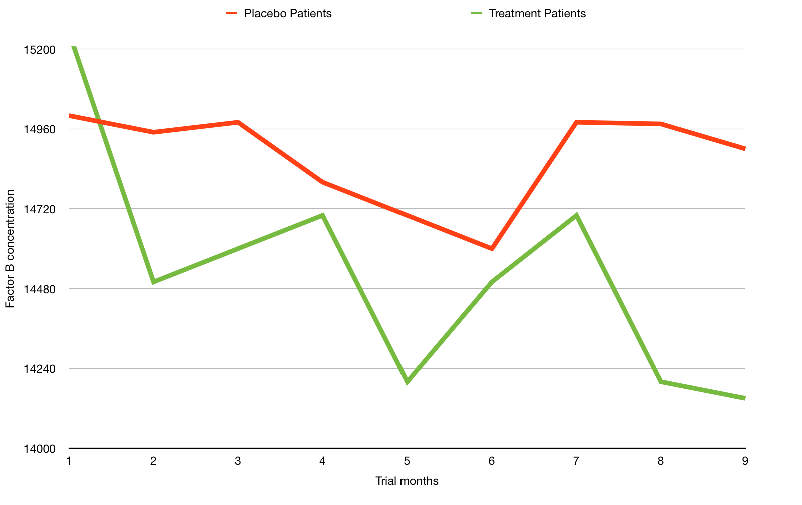
Here is an example of another purely hypothetical trial chart with green (treatment) and red (placebo) lines showing two different measurements for a hypothetical biological chemical factor B over time. The lower the number of the factor being good and higher being bad.
From this chart a reader could easily interpret that the green line shows a beneficial effect compared to the the red line. This is a great example of a gee whizz chart. And did I really assign the colours green and red randomly?!
What are the issues? You can probably guess, but the key ones are:
- The chart shows a relatively short period of months, perhaps only of the short run in and the months of the actual trial.
- The y-axis scale is compressed and only partly shown – This has a visual effect of amplifying any perceived change. See how the line dramatically drops?
But here is a possible wider context of precisely the same data (months 1 to 9) shown above but with time before and after.

This time we observe a greater time range. Does the change look so significant now? In fact you have to look very carefully to spot the same drop in reading.
But we also see the data on a fully proportional y-axis. This begs the question – is this chemical measure fluctuation within possibly naturally high ranges?
This is why data and rigorous analysis is that foundation I spoke of earlier and we should reflect that what we might read on first sight may not just, yet, be the whole story, or may be reliant on further new data/experimentation.
Oh, one last thing, did the eagle eyed amongst you notice my own rather sneaky usage of the ‘gee whizz’ chart technique earlier with the 1.2 point slope improvement?
After reading this post you might now feel that it will be very difficult to get a treatment ever approved. This couldn’t be further from the truth. With clear cut point data, over a representative disease time, treatments would and will be approved. I know it’s a worn out statement, but science is closer than ever to effective treatments.
Bring on those eagerly awaited trial results, researchers!! But only when ready, of course.
Remember, folks, the devil is in the detail, as always!
I will return with yet another devilish post in the near future, that is provisionally titled…
“More than one way to skin a cat!”
